NEOMO

What is this?
Neomorphism(neumorphism) Design Framework Open Source
Neomorphism(neumorphism) Design Framework Open Source
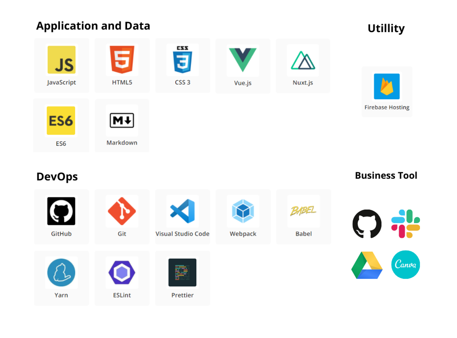
Tech Stack
Organization
neomo/
├── css/
│ ├── components/
│ │ ├── alert.css
│ │ ├── badge.css
│ │ ├── breadcrumb.css
│ │ ├── button.css
│ │ ├── card.css
│ │ ├── dropdown.css
│ │ ├── icon.css
│ │ ├── modal.css
│ │ ├── navbar.css
│ │ ├── navigation.css
│ │ ├── pagination.css
│ │ ├── progressbar.css
│ │ ├── select.css
│ │ ├── spinners.css
│ │ ├── tab.css
│ │ ├── toast.css
│ │ └── tooltips.css
│ ├── content/
│ │ └── table.css
│ ├── forms/
│ │ ├── checkbox.css
│ │ ├── file.css
│ │ ├── floatinglabel.css
│ │ ├── input.css
│ │ ├── radio.css
│ │ ├── range.css
│ │ └── switches.css
│ ├── helpers/
│ │ ├── coloredLinks.css
│ │ └── typography.css
│ ├── layout/
│ │ ├── columns.css
│ │ └── container.css
│ ├── color.css
│ └── neomo.css
├── dist/
│ ├── neomo.min.css
│ └── neomo.min.js
└── js/
└── neomo.js
1. button.css
가운데 정렬
justify-content: center; //가로축을 기준으로 좌우에 대한 정렬
align-items: center; //세로축을 기준으로 좌우에 대한 정렬
box-shadow
.button:hover { outline: 0; cursor: pointer; box-shadow: inset 3px 3px 5px #b8b9be, inset -3px -3px 5px #fff !important; }- inset 뒤에 오는 첫 번째 요소: offset-x, 수평 거리를 의미하며 음수 값은 그림자를 요소의 왼쪽에 표시함
- inset 뒤에 오는 두 번째 요소: offset-y, 수직 거리를 의미하며 음수 값은 그림자를 요소의 위쪽에 표시함
- inset 뒤에 오는 세 번째 요소: blur-radius, 값이 클수록 그림자 테두리가 흐려지고 크기가 더 커지고 색이 더 밝아짐
버튼 크기 설정
button.normal { width: 5rem; height: 2.7rem; }- 절대적인 값: px
- 상대적인 값: rem, em
- rem: 기준이 되는 값은 최상위 요소의 font-size (e.g. html 태그)
- em: 기준이 되는 값은 현재 스타일 지정 요소의 font-size (e.g. div 태그)
2. spinners.css
animation
.loader.point-purple { border-bottom: 3px solid var(--purple); border-radius: 50%; width: 1.5em; height: 1.5em; animation: spin 2s linear infinite; } @keyframes spin { 0% { transform: rotate(0deg); } 100% { transform: rotate(360deg); } }- 0% 대신 From 사용 가능
- 100% 대신 To 사용 가능
- animation-timing-function: linear -> 애니메이션 효과가 처음부터 끝까지 일정한 속도로 진행
- animation-iteration-count: infinite
3. tooltips.css
display
.tooltip { position: relative; display: inline-block; }- inline: 전후 줄바꿈 없이 한 줄에 다른 엘리먼트들과 나란히 배치
- block: 전후 줄바꿈이 들어가 혼자 한 줄 차지
- inline-block: inline 엘리먼트처럼 나란히 배치되지만, width & height & margin & padding 속성 지정 가능
position
.tooltip { position: relative; display: inline-block; } .tooltip .tooltip-content { visibility: hidden; padding: 7px; width: fit-content; position: absolute; z-index: 100; }- static: position 속성을 부여하지 않았을 때 가지는 디폴트 값
- relative: 현재 위치에서 상대적인 offset 속성을 줄 수 있음
- absolute: 부모 중에 static이 아닌 요소의 위치를 기준으로 상대적인 offset 속성을 줄 수 있음(현재 위치가 변하는 것은 아님!)
translate
.tooltip .tooltip-content.bottom { transform: translateX(-50%); top: 115%; left: 50%; }- 현재 위치를 기준으로 이동
- translateX(): 가로로 이동(양수 값은 오른쪽/음수 값은 왼쪽)
- translateY(): 세로로 이동(양수 값은 아래쪽/음수 값은 위쪽)
- translate(X, Y): 가로세로 값으로 이동
4. input.css
> 결합자
.input-group > input { border: none; }- 첫 번째 요소의 바로 아래 자식인 노드를 선택
- 첫 번째 요소의 바로 아래 자식인 노드를 선택
flex
.input-group { display: flex; width: fit-content; border-radius: 10px; box-shadow: 3px 3px 7px #ababab, -3px -3px 7px #ffffff; }- flex container
- container 안에 있는 아이템들은 가로 방향으로 배치되고, 자신이 가진 내용물의 width만큼만 차지
- flex-direction은 row, column, row-reverse, column-reverse가 있음
5. switches.css
+ 결합자
input:checked + .switch { background: white; box-shadow: inset 3px 3px 5px #b8b9be, inset -3px -3px 5px #fff; }- 첫 번째 요소의 바로 뒤에 위치하면서 같은 부모를 공유하는 두 번째 선택
- 첫 번째 요소의 바로 뒤에 위치하면서 같은 부모를 공유하는 두 번째 선택
6. CSS Selectors
유형 선택자
input { }- 주어진 노드 이름(input)을 가진 모든 요소를 선택
- 주어진 노드 이름(input)을 가진 모든 요소를 선택
클래스 선택자
.index { }- 주어진 클래스 특성(index)을 가진 모든 요소를 선택
- 주어진 클래스 특성(index)을 가진 모든 요소를 선택
ID 선택자
#toc { }- id 특성(toc)에 따라 요소를 선택
- 문서 내에는 주어진 id를 가진 요소가 하나만 존재